Let’s Talk IFTTT
I think that for most creative product people, making things work better also means making their gizmos look better along the way. Getting bored quickly goes with the territory of product design. The need to scratch that itch though must always be balanced with what's best for the user experience (UX).
Some products are so useful that even a boring utilitarian design contributes to the image. Such is how I often looked at the product called IFTTT (If This Then That) – a service which connects all types of web services and products together.
I applaud the IFTTT team for developing such a time-saving and useful tool. Its like the duct tape of the web when it comes to patching things together. Thank you IFTTT for your hard work in maintaining what must be a headache inducing task of keeping so many, often disparate, services humming along together.
Yet, the recent app redesign of IFTTT is proving rather harmful to the brand image as users grapple with a confusing UI that was probably meant to address someone's complaint that the service was too difficult to use (maybe even offsetting). The attempt to improve and give a face-lift is unfortunately producing many 1 star reviews in the App Store.
When that happens, it's imperative that all hands are on deck to tackle and release UX fixes quickly. It's always better to slowly and deliberately tackle the details of UX prior to a major product release, but no one is perfect and details can get lost. Mistakes happen. Fixing them in a timely manner though, while acknowledging the reasons for 1 star reviews can go a long way in patching up user discontent.
What Went Wrong
I'm not sure if the IFTTT team had a major org change, but whatever happened, a quick UX iteration is critical for restoring what most value about IFTTT – its utilitarian ubiquitous usefulness.
IFTTT had 3 stand-alone side apps called Do Note, Do Button and Do Camera. They were the one-two taps or slide homepage apps for invoking often used recipes (now called applets). We loved them for the most part because they were speedy ways to trigger applets we often used.
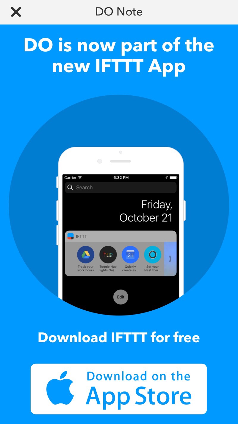
One day, we opened our Do apps and were greeted with a message that Do was now part of the newly relaunched IFTTT app. There were no details explaining what this implied though. Were the Do apps going away? Could we still use our Do apps? Did we have to manage all settings from inside IFTTT's main app? Could we still manage settings within the Do app? Why weren't these questions addressed?
Also, how is the word “applet” an improvement over the word “recipe”?
So off we went to the new IFTTT app to poke around. We found it difficult to find our recipes (now applets), but soon placed in a My Applet tab. The new UI involved xx-large colored boxes with large text that now forced us to scroll through our long list of applets, not made any easier by the fact that these applet boxes take up so much screen real estate. A large screen device displays about 1 and ¾ applets when first opening the My Applet tab. Did someone really believe that users would not mind so much scrolling?
We typed Do in the search / filter field, but found nothing. So we scrolled and scrolled looking for the Do keyword in a recipe, ummm applet, but found nothing. We had to figure out that the Do applets were there, but just not named Do in any descriptions.
Did someone think that making users think so much was good for UX?
Maybe at some point, we learned that Do could be found. It was placed in the Settings screen. Really? Yes, really. It was here that we could make Do widgets, add an icon to our homescreens and access the actual Do applet too (though not named Do).
Many found that old recipes (converted to applets) were no longer working correctly. A product team can miss bugs, but there was just so much unnecessary relaunch pain.
So much confusion and work for a utilitarian product.
We Love IFTTT
IFTTT will recover. I'm hopeful that the team is working hard on rolling out fixes – hopefully.
A little shade though on the PM who signed off on this. That role should have prevented this many mistakes.
We still love you IFTTT – just give us a better UX quickly.
Be Sure Of Your Changes
Any redesign or relaunch can be riddled with issues. Good UX folks though can help identify and minimize unnecessary issues before the rollout. Here's where in-the-trench experience proves its weight in salt. Empower your UX staff and be sure that your changes are for the best. If you learn that they are not, iterate quickly. A solid UX focused team understands that sometimes, it's ok for duct tape to be boring gray.


