
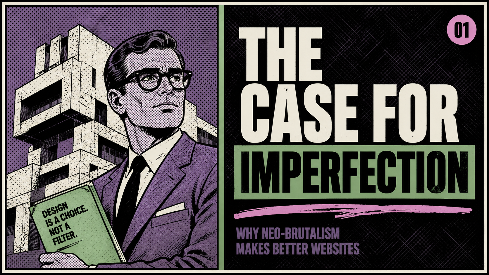
The Case for Neo-Brutalism Web Design in 2026
A few years back, I spent an embarrassing amount of time trying to get a drop shadow just right. Not too soft, not too hard. The exact right blur radius. The perfect offset. Nobody ever noticed. And honestly, that was the problem.
We spent the better part of a decade chasing a kind of frictionless digital perfection -- smooth gradients, gentle rounded corners, everything hovering at a tasteful distance from the background. Every site looked like it had been pressure-washed. Clean, yes. Memorable, not so much.
Something is shifting.
The Web Got Tired of Itself
For more than a decade, the web trended toward slick, safe templates. As more brands began to look alike, certain audiences started craving something different -- something that signals honesty over packaging. That craving has a name now: neo-brutalism web design. And in 2026, it has moved well past fringe into genuine mainstream momentum.
The movement draws from brutalist architecture -- that mid-century philosophy that said: show the bones. Don't hide the concrete behind a facade. Let the structure be the statement. Translated to web design, that means visible grids, hard edges, blunt typography, high-contrast color, and a willingness to leave seams visible. Bold layouts, raw structures, and unapologetic type are back. It's minimalism -- but with attitude.
Imperfection as Intention
What makes this more than a passing aesthetic reaction is the cultural timing. When every AI-generated image looks glossy and every template looks polished, the thing that actually stops someone mid-scroll is something that looks like a human being made a deliberate choice.
This pushback against hyper-perfect UI -- raw edges, visible process, intentional friction, sketch-like elements -- is a rebellion against the algorithmic smoothness of modern design. That word "intentional" is key. This isn't sloppiness. The best neo-brutalist work is disciplined. The roughness is considered. The asymmetry is earned.
What It Actually Looks Like in the Wild
Two sites worth looking at side by side -- because they show how differently this philosophy can land.
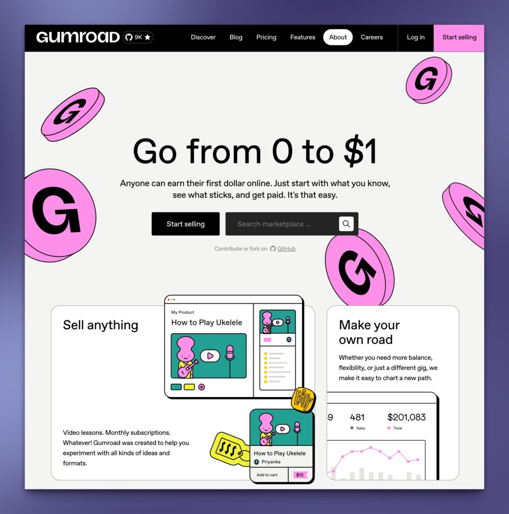
Gumroad is probably the most cited mainstream example. They walked away from the polished SaaS look entirely -- vibrant flat color sections, thick black outlines, typography that takes up real estate unapologetically. It reads like a digital zine. For a platform built around independent creators, that's not a coincidence. The raw aesthetic is the brand statement: we're not corporate, we're not trying to impress you, the work speaks for itself.
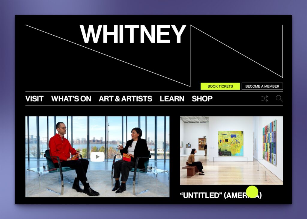
The Whitney Museum takes the same philosophy in a completely different direction. Their site is stripped down, editorial, almost austere. Large type, minimal decoration, structure you can see. The art gets the attention -- the design steps aside. It's not cold, it's deliberate. The rough edges there communicate something specific: this institution doesn't need to dress things up.
Two different industries, two different executions -- same underlying conviction that showing the bones is more honest than hiding them.
The Visual Signals to Watch For
Whether a site goes full Gumroad or restrains itself like the Whitney, neo-brutalist work tends to share a few consistent traits:
Heavy, flat typography. Oversized headlines that own the page. Geometric sans-serifs at weights that make no apologies. Type treated as a layout element, not just a label.
Visible structure. Grids that don't hide. Borders that are borders, not suggestions. Elements that look like they're sitting on a surface rather than floating above it.
High contrast color. Not necessarily loud -- but unambiguous. The goal is clarity, not decoration.
Texture and grain. Backgrounds that feel physical. Subtle noise. Paper-like surfaces that push back against the screen's natural sterility.
Hand-drawn elements. Scrawled annotations, rough illustration lines, type that looks like it came from a marker -- celebrating the designer's hand in a world increasingly shaped by AI.
Is It Right for Every Brand?
No, and that's worth being direct about. This approach works well for creative agencies, independent platforms, cultural institutions, and brands actively seeking differentiation. It's a harder fit for financial services, healthcare, and enterprise contexts where conventional polish signals trustworthiness.
Mission-driven organizations -- nonprofits, advocacy groups, wellness brands -- sit in interesting territory. The raw, honest quality of neo-brutalism can communicate values beautifully when applied with intention. A hand-drawn element in a header, a deliberately imperfect texture in a section background, bold type that says we mean it. None of that requires a full aesthetic overhaul. It's texture added to intent.
The brands getting this right aren't throwing out their design systems. They're finding the one or two places where a rough edge actually says something.
The Bigger Point
If minimalism once taught us to remove the unnecessary, neo-brutalism teaches us to make visible the hand of creation -- to let structure, texture, and friction carry meaning. It's not a license for carelessness. It's a disciplined aesthetic that requires restraint, craft, and clear intention.
The sites that stood out this year weren't the ones with the smoothest scroll animations. They were the ones that looked like someone actually cared what they were making -- and wasn't afraid to show it.
That's always been good design. We just forgot for a while. The eye wants a little imperfection now and then.